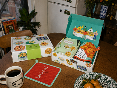
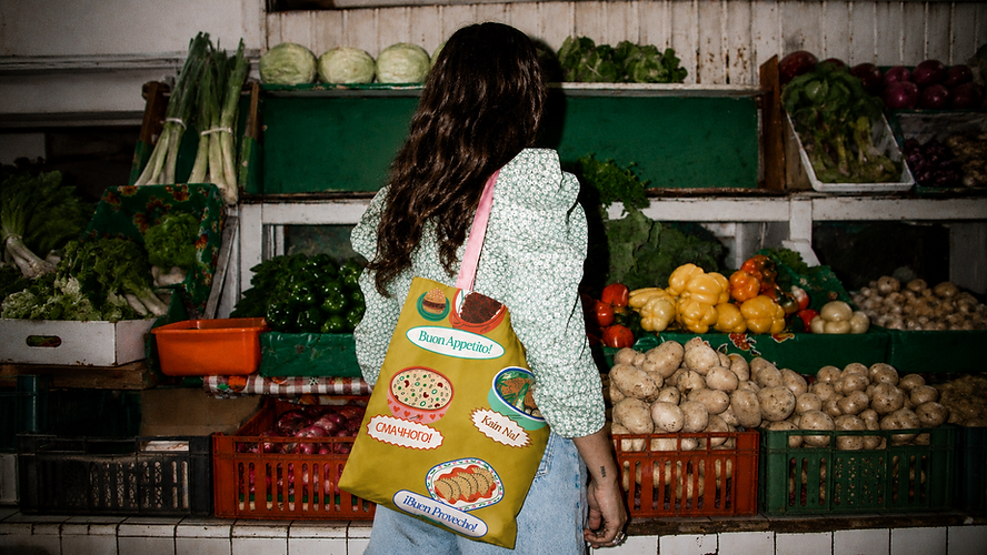
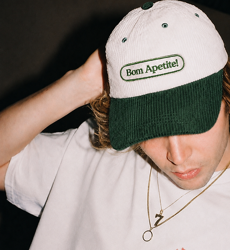
Cook it Up
Art Direction, Visual Design
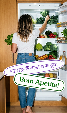
Upwork's Belonging Communities wanted a way to celebrate the company,
and the wildly different cultures inside it, through the one thing we all do at home: cook. A fully remote team, three hundred-plus people across thirty countries, every kitchen a different cookbook. They asked for a place to
put those recipes.
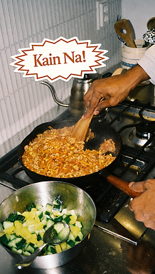
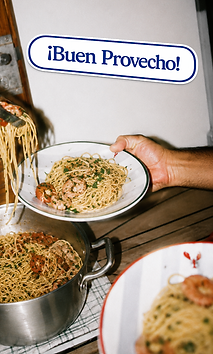
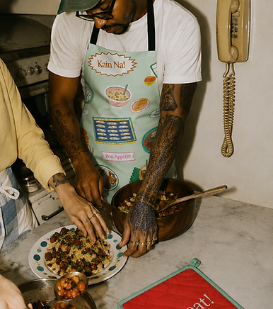
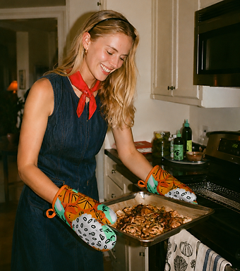
Each designer on our team took a crack at the brief, but what landed me the project was this insight: the best meals are a little crowded, full of smells and bordering on sensory overload (in the best way possible). Whether that's a night market stall in Vietnam, a courtyard kitchen in Lagos, or six friends crammed into a Brooklyn studio with one burner working, the energy is the same.
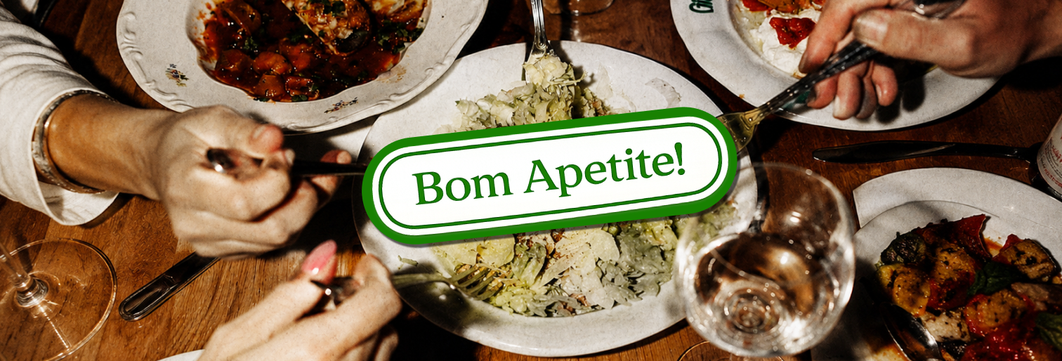
That feeling became my design target. Color, type, scale, and illustration all had one job: put the reader inside those crowded kitchens, cooking elbow to elbow with the people they love.
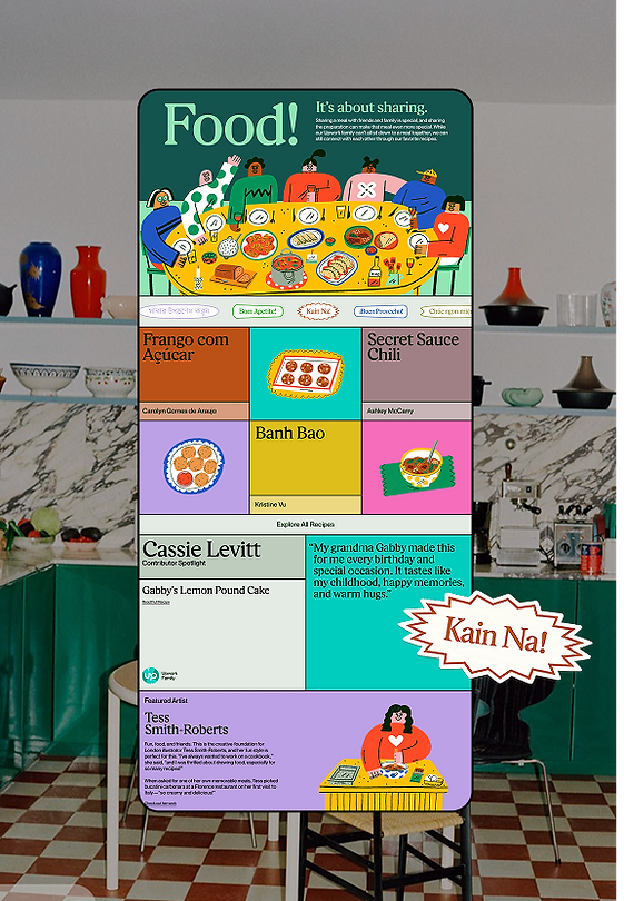
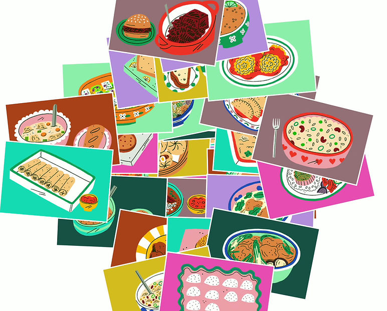
An illustration
style you can taste
When it came to setting an illustration direction, I knew what I didn't want: perfection. I wanted you to smell the food just by looking at it. To feel the spills and splatters that inevitably happen when you share a meal with the people you love.
A tight moodboard gave our producers exactly what they needed to go looking.
They came back with London-based illustrator Tess Smith-Roberts who
brought this vision to life.
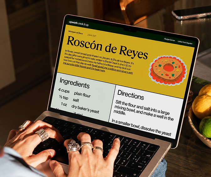
An interface designed with
the user in mind
If you've ever tried to cook from a recipe blog, you know the frustration of having to zoom and scroll with sticky fingers to read type that is entirely too small.
I wanted to eliminate that struggle, and so made the conscious choice to enlarge the type on the recipe screen so that cook spent less time zooming, and more time zesting.